Digital Signage
 Phone App
 Web Embeddables
 Neighborhoods
Data Hub
Educate
Data Hub is a powerful and intuitive package of online data visualization tools. Data Hub makes it easy for managers, educators, students and communicators to translate real-time data acquired from a variety of sources into compelling visualizations that are easily understood and can be shared on websites and digital signage to tell stories of impact and opportunity.
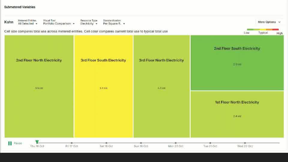
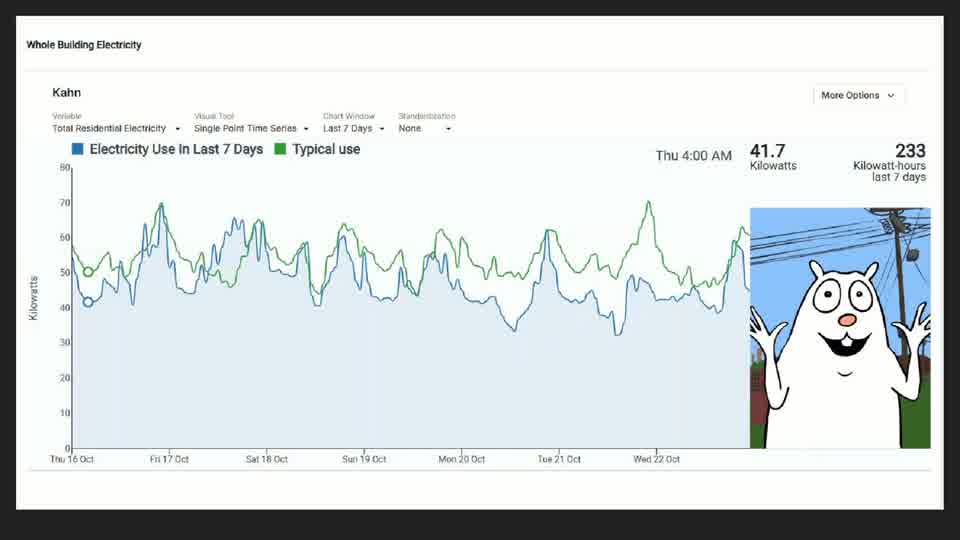
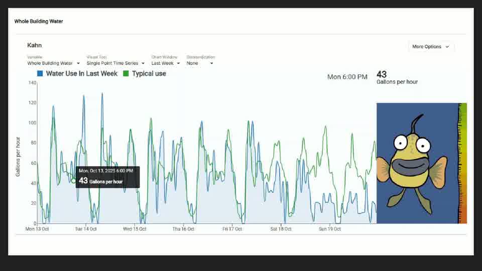
Oberlin College dashboard screens.
Data Visualizer / Explorer
Time series
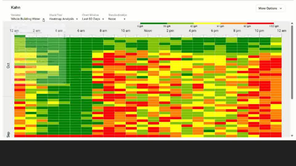
View resource use data over a selected period of time. Display multiple variables on one time series graph to see how they compare. Choose from week, weekend, month, or year view. Customize a unique time window by setting a start and end date. View today’s data trends as well as yesterdays on the same time axis to compare and contrast resource use patterns.
Line Graph, Heat Map, Load Profile
Choose which variable(s) you wish to graph.
Gauges
Share collected data via simple and interpretable visual indicators. CommunityHub offers various animated gauges that can stand alone or supplement other data visualizations. Needle Gauge · Odometer Gauge · Empathetic Character
Group comparison
Compare conditions among (and within) monitored points over a specific time period. Each building is represented by a box. The size and color of the box corresponds with the building’s magnitude of resource use in comparison to others within the set.
Data Manager
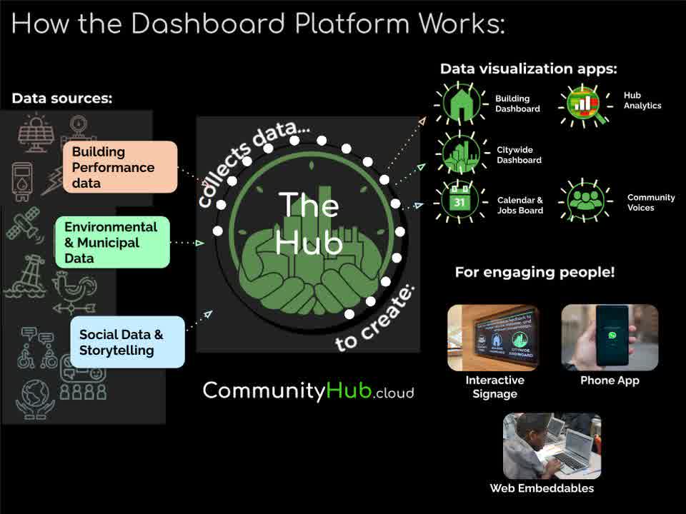
The data manager provides the tools for capturing and configuring real-time data from a wide variety of sources that include building automation systems, SCADA systems, independent datalogging devices and data that are publically accessible from weather stations and air and water quality monitoring stations.
 Building automation systemsModern building automation systems use or can be equipped with a device known as a JACE that stores all metered data. Additional metering can be added and the JACE configured to automatically transfers real-time data gathered by that system to CHub.
 SCADA systemsSCADA systems used by public utilities and manufacturing sites
 Obvius dataloggersObvius brand dataloggers
 AirNowEPA air quality monitoring stations through AirNow
 GLOS and USGSwater quality monitoring stations such as GLOS bouys and USGS stations
 Any CSV exportany other device that can be automated to export .CSV files.
A simple equation editor window allows users to easily create derived variables from those that are acquired. For example new variables representing greenhouse gas emissions can be created associated with electricity, gas and water use and then added together to express total greenhouse gas emissions for a given monitored entity.
How the Dashboard Platform Works
Assemble, interpret, and share unique data stories
Choose from various data visualizations to tell the story of a building, community, environment, and more
“For a decade we have looked to the CommunityHub team as key partners in translating our energy conservation services into community engagement”

Building Dashboard
Loading the Oberlin Public Library's data…